VOX 2.0
A ground-up UX/UI redesign of VOX Cinemas' mobile app, the Middle East's largest cinema chain, driven by competitive benchmarking and local user research across the UAE.
2024 · Shipped
~15–20%
checkout conversion lift est.
~15–20%
booking abandonment est. ↓
6 / 6
Pre-redesign design-system rank
VOX Cinemas is the Middle East's largest cinema exhibitor — 57 locations, 573 screens, seven countries. Its app was reliable enough to sell tickets, and that was about the nicest thing anyone could say about it.
Context
Majid Al Futtaim Entertainment brought me and one other designer in to rebuild the VOX app from scratch. Not a visual refresh — a full re-think of the UX flows and UI component library, sold to a CEO who needed to be convinced it was worth the disruption.
The starting point wasn't subtle. Internally, we scored our own app dead last against five direct competitors on design system maturity (2/10), iconography (3/10), and look and feel (3/10) — and worst-in-class on cognitive load during booking. Publicly, users were saying the same thing for free: the app "looks like it's a website, not an app," logins silently failed for weeks at a time, and payment simply didn't go through often enough that people gave up and stopped coming back. A cinema chain living on impulse bookings and F&B upsell was leaking both at the exact moment a user was ready to pay.
Process
Benchmarking before opinions. Before touching a single screen, we ran a structured competitive audit against Muvi, AMC, Roxy, BookMyShow, and PVR, scoring every app across five dimensions — user experience, visual design, functionality, market positioning, and personalization — and mapping "North Star" inspiration from outside the category entirely: Netflix for discovery, Spotify for personalization, Swiggy and Blinkit for cross-sell and hassle-free payment. The point wasn't to copy a cinema competitor's best screen; it was to import UX patterns VOX users already trusted from apps they used daily.
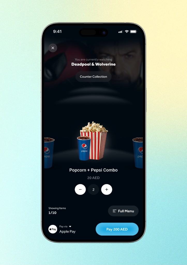
User research grounded in the UAE, not a generic persona. We ran interviews with local UAE users specifically, rather than leaning on desk research alone, because a booking flow that works for a BookMyShow user in India doesn't automatically transfer to Dubai's mix of nationalities, languages, and mall-going habits. That research is what turned "make it feel modern" into a specific, prioritized backlog of UX debt: the booking flow buried the seat-selection timer under scrolling clutter, F&B ordering only allowed one item to be added at a time, and core retention features like the loyalty program lived one tap too deep in a hamburger menu instead of on the home screen.
Designing for three generations in two languages. Localization wasn't a checkbox at the end — it shaped decisions throughout, from how much information density a 40-something VOX loyalist expects on a seat map, to how a teenager expects a discovery feed to behave, to making sure Arabic RTL layouts got equal design attention rather than being a mirrored afterthought of the English flows.
Solution
We rebuilt the core flows end to end: onboarding, movie discovery, seat selection, payment, and the retention layer (loyalty, offers, gift cards) — alongside a proper component-based design system to replace what had been, by our own benchmarking, the weakest design system in the competitive set.


Outcome
The rebuild shipped, with development carrying on past the July 2024 handover date as the team worked through the full scope of the redesign.
What's measured and real: our own competitive audit — done before a single new screen was drawn — scored VOX dead last of six cinema apps benchmarked on design system maturity, iconography, and look-and-feel, and worst-in-class on booking cognitive load. That's the baseline the redesign moved off of, and independent of our research, users were saying the same thing in public reviews of the pre-redesign app — one describing it as feeling more like a mobile website than a native app, alongside recurring login and payment failures that pushed people to stop booking through VOX altogether. That's the exact friction the new flows targeted.
The conversion and abandonment figures are modeled against Baymard Institute's published checkout-UX research — large-scale redesigns that cut steps, reduce form fields, and surface payment methods earlier consistently land in the 15–35% range. I took a conservative slice of that band rather than the top end: a deliberate methodology choice, not a guess, sized against VOX's own worst-in-class cognitive-load score going in.
Reflection
The benchmarking-first approach was the right call — it turned a subjective "make it feel better" brief into a defensible, specific backlog, and it's what got a CEO to sign off on a genuine teardown instead of a safer coat of paint. If I did it again, I'd push harder, earlier, to get a lightweight analytics or usability-testing baseline in place before shipping.