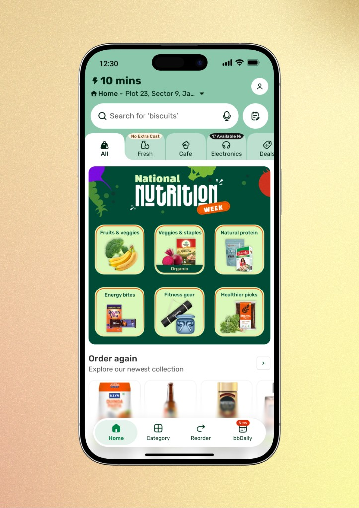
Home Navigation Redesign
Rebuilt bigbasket's home navigation around a familiar browser-tab model for Lines of Business, doubling click-through rate across categories.
2026 · Shipped
2x
LOB click-through rate
+30–35%
Category page visits (est.)
~1.8x
LOBs explored per session (est.)
People couldn't find what bigbasket actually sold. Fresh groceries, Cafe, Electronics, Pharma, Deals — it was all there, but buried behind navigation that didn't make the breadth of the app legible. We rebuilt the home navigation from a clean slate and landed on something people already knew how to use: browser tabs. Click-through rate across Lines of Business doubled.
Context
bigbasket had quietly grown from a grocery app into a multi-category marketplace — groceries, a cafe line, electronics, pharma, daily essentials, seasonal deals — but the home page navigation hadn't grown with it. Categories and services existed, but discovery was weak: users defaulted to the one or two things they always bought and never realized how much else was a tap away. For the business, that meant real inventory and revenue sitting invisible to most users. Fixing discoverability meant touching the most-used surface in the app — the home header and navigation — without breaking the muscle memory of millions of daily users.
Constraints
This also landed while the team was building a new design system from scratch, which meant the project doubled as the system's first real-world stress test — every token, component, and theming rule had to hold up against this many edge cases or the system itself needed to change.
Process
We started fully open — no inherited pattern, just an exploration of what "clean and light" navigation could look like for a multi-category app. After a few rounds of testing with real users, the pattern that resonated was one they'd already internalized elsewhere: browser tabs. Each Line of Business became a tab a user could select, scroll to, and return to — sticky, centered on selection, and stateful across navigation (leave the Pharma tab, browse a category, hit back, land right where you left off).


Solution
The final system had three tightly-scoped surfaces: a tokenized home header (title, account entry, ETA, single-line address, search), a browser-tab-style LOB navigation bar that reordered by priority and auto-scrolled to center whatever was selected, and a bottom navigation bar unchanged in function but rebuilt to visual spec — with a horizontally-scrollable variant to support a Brand of the Day slot without displacing core entry points like Home, Category, and Reorder.

Every state — LOB count below the minimum threshold, blank ETA data, missing brand-of-the-day config — had a defined fallback so the header never rendered broken or empty.
Outcome
We shipped in phases: a preliminary release to high-traffic regions like Bangalore and Mumbai, followed by a full India rollout by January 2026, after leadership, department heads, and multiple rounds of UAT and user testing signed off on the design.
The CTR figure is measured; the other two are modeled off the CTR lift and comparable navigation-pattern benchmarks, not pulled from analytics directly — directionally consistent with the CTR jump, but I'd caveat them as estimates in an interview rather than cite them as tracked numbers. Beyond these, basket visibility improved and the Order Assistant became noticeably easier to use — the redesigned header made room to surface more of the information it needed without crowding the rest of the page.
Reflection
The hardest part wasn't the visual design — it was holding the line on 100+ edge cases without letting the system sprawl. Setting hard rules early (one ticker at a time, a single communication dismiss behavior, fixed character budgets) did more for consistency than any component library could have on its own. If I did this again, I'd push to define those rules even earlier, before high-fidelity exploration started, rather than converging on them mid-project.